Black & white is a great way to present images for all sorts of reasons – to achieve a timeless look, to de-emphasise distractions, and to deal with tricky lighting (such as orange sodium lights at night). It’s especially popular in portraiture and street photography, but can also work brilliantly for landscapes – see Ansel Adams.
But black & white isn’t the only way to achieve a monochrome effect. Any colour could replace the black – you could choose blue or sepia, for example.
The key to a successful monochrome image is contrast. Whether you take your image in monochrome mode on your camera, or you convert it from colour afterwards, you want plenty of darker areas and plenty of lighter areas – or you’ll end up with lots of muddy areas all clustered around the middle ranges.
Read on to find out when an image is and isn’t truly monochrome, and about acceptability in competitions.
Before we start: Monochrome vs duotone
Remember, ‘mono’ = one, and ‘chrome’ = colour. A true monochrome image has only one hue, such as black, red or blue, across all tonal values – from very light to very dark. A duotone has two distinct hues (such as black + red, or blue + yellow), which produces areas of different colour rather than just one hue in different lightness.
Choosing your colour affects your variations
The key to monochrome is to pick one base colour, your ‘hue’, and then work through to white (as your non-colour). Here’s how variations work:
Hue = pure colour
Shade = hue + black
Tint = hue + white
Tone = hue + grey
You can see from that list that if your key colour is black, then all of these apply. However, if you choose red, then if you want a monochrome you can’t also have black – so that knocks out the ability to use grey, as well. Your monochrome image would have to be based on a very dark red, to give you intensity and shadows, working through tints of red + white until you get to white.
Converting to B&W
There are several ways to convert a colour image to B&W:
- You might simply choose a filter on your phone or in photo-editing software
- Or, or in photo-editing software, you might convert the image straight to greyscale. For example, in Photoshop, you’d go to Image > Mode > Greyscale
However, those methods don’t give you much choice over the final result. Filters, and going straight to greyscale, don’t understand the mood of your photo, or what you want to achieve, so you may prefer to do it manually:
- (Again in Photoshop) you can be more selective about the end result by using the colour channel sliders via Image > Adjustments > Black & white. The sliders let you choose whether to bring forward, say, the reds and yellows while knocking back the blues or greens. This selectivity can really help you balance your lights and darks when you’re working with skin tones, or a heavily green landscape.
Caution: When B&W isn’t B&W
If you convert your image straight to greyscale, you’ve got a true monochrome image. But if you do it using the colour channel sliders, you’ll end up with an image which looks B&W but is actually still a colour image, either CMYK or RGB (because you can still adjust the reds, blues etc, right?). So to achieve a true monochrome image once you’re happy with the effect of the channel sliders, you must then convert your image to greyscale (Image > Mode > Greyscale in Photoshop).
If you don’t, you don’t have a monochrome image, and there are multiple ways to check if an image is truly greyscale or not. If you’re entering a competition, there’s always a chance that the judge could check your image – so it’s best to always convert a B&W image to greyscale once you’re happy with your manual editing results.
Caution: Other than B&W, monochrome isn’t really monochrome
In offset printing, which uses one printing plate per colour, you usually work in 4 colours – CMYK. These stand for cyan (turquoise), magenta (pinky red), yellow, and black. All colours are then mixed out of those 4 hues. But if you need one colour in your image to be perfectly replicated (such as a logo colour), or you need a special colour like a metallic gold, you’d add in an extra plate for a ‘spot’ colour – usually a Pantone ink, which means the colour will be accurate and globally consistent.
The fact that most printing is done without ‘spot’ colours demonstrates that almost all colours are made up of C, M, Y and K. On that basis, how do you get a true monochrome photograph in anything other than black? After all, you can’t use a Pantone ink!
Non-B&W monochromes using the example of sepia
A popular choice in photography is sepia. A sepia image has been given a warm brown tone, typically ranging from yellowish-brown to reddish-brown. Originally, sepia toning was a process used in darkroom photography, so it’s often used to give a historical effect.
A true sepia image doesn’t have pure black. Instead, the darkest tones are replaced with the darkest variants of the brown. A true monochrome sepia image is made of a single hue (sepia/brown), rather than being what seems to be B&W plus a sepia overlay (‘seems‘ because how could the B&W image be greyscale if you can add a sepia overlay?). Many quick filters just tint the image, but they don’t actually reduce it to one hue + luminance values.
In a true sepia monochrome image, dark areas may appear black even though they technically carry a hue value. If you check with the colour-picker in Photoshop, you’ll see that the darkest pixels are actually very deep browns (not a neutral 0,0,0 black).
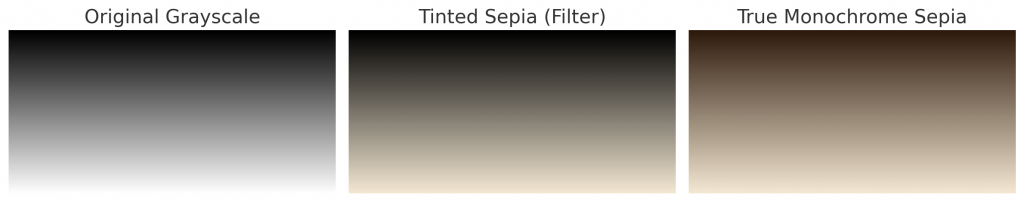
- Original grayscale – pure black to white
- Tinted sepia (filter) – a colour layer added over grayscale, but still has neutral blacks mixed in. This is then a duotone of 2 distinct hues (black ink + brown ink) – which is not monochrome.
- True monochrome sepia – the whole gradient is one hue (brown), stretched across all tonal ranges in different lightness values, with no pure black or grey.
“But wait!” I hear you say. “I thought all non-blacks were mixed out of CMYK, so how can even a ‘true’ sepia monochrome be anything but a full-colour image?”
You’re absolutely right. But read on.
Non-B&W monochromes – acceptability in competitions
In a photography competition context, a monochrome image is one that uses only one hue (and its lightness variations):
- B&W would be a neutral monochrome
- Sepia, cyanotype or shades of red would be a tinted monochrome.
As shown in the images above, a true sepia monochrome image is rendered using only one hue (brown) with different tonal values from light to dark. So although that brown contains red and yellow components, it is still just one hue family applied consistently across the image. The key is that there are no independent, multiple colours (like red + green + blue areas). Every pixel shares the same hue angle on the colour wheel, only differing in saturation or brightness.
Judges accept sepia in monochrome competitions because it follows the photographic definition of monochrome (one hue + luminance). The fact that the hue itself is composed of red/yellow components doesn’t matter, because the whole image still belongs to the same hue family. However, the image should not contain pure black anywhere because then it is a duotone. And if it contains any outliers like purple or green (for example, hidden in the shadows) then can’t count as even a tinted monochrome.